SKIPPERS TARTAR SAUCE
2024 PACKAGING PROJECT
Adobe Illustrator, Adobe Photoshop, Photography
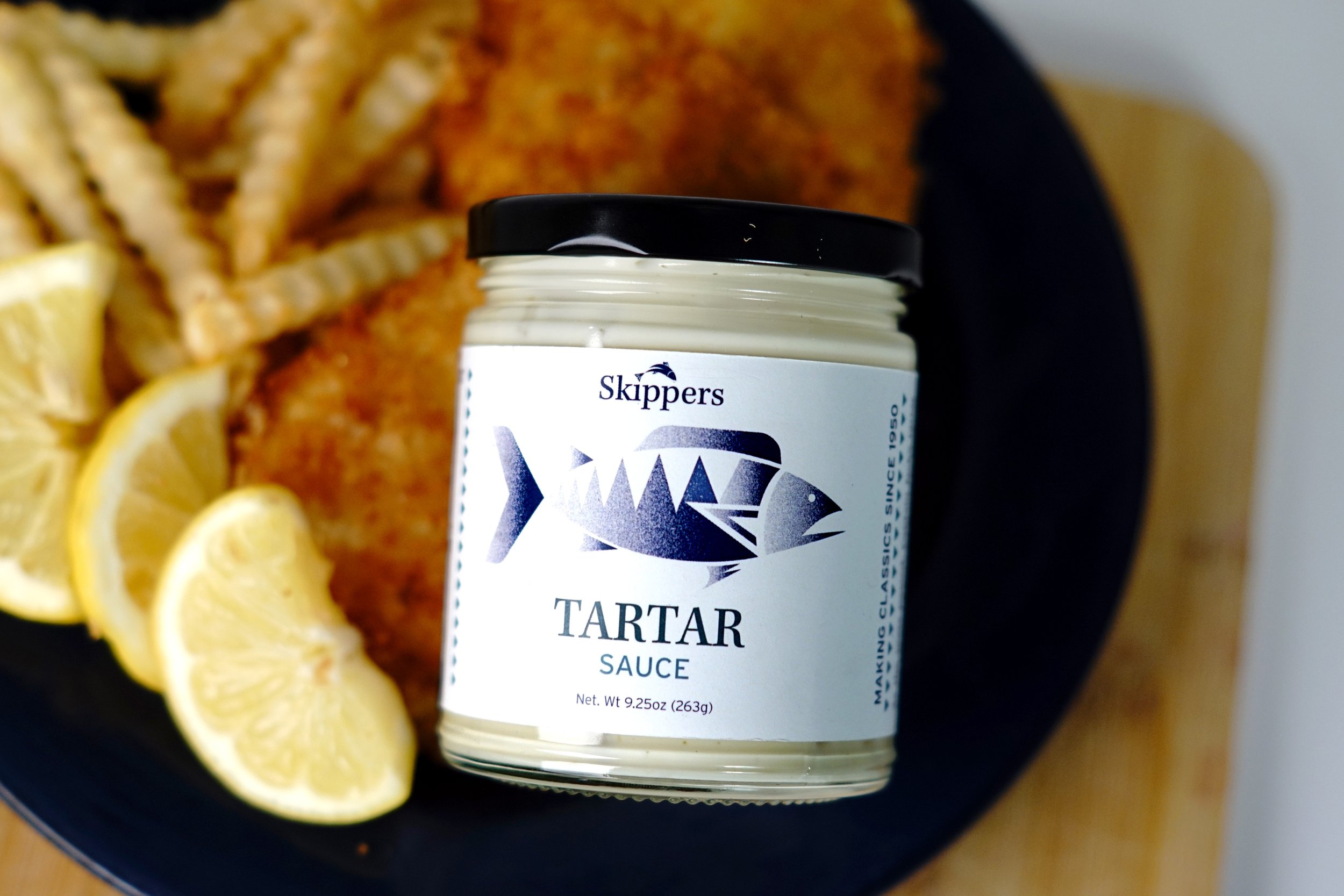
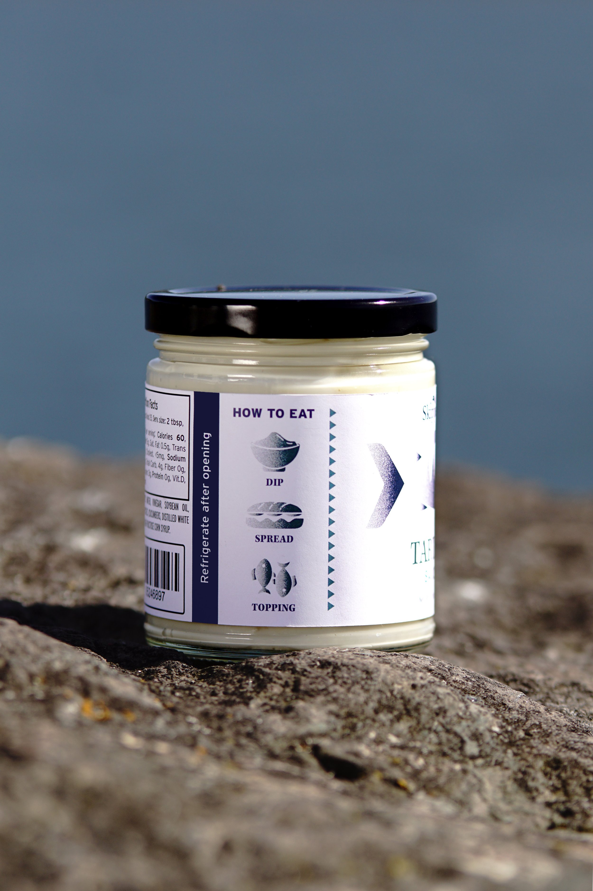
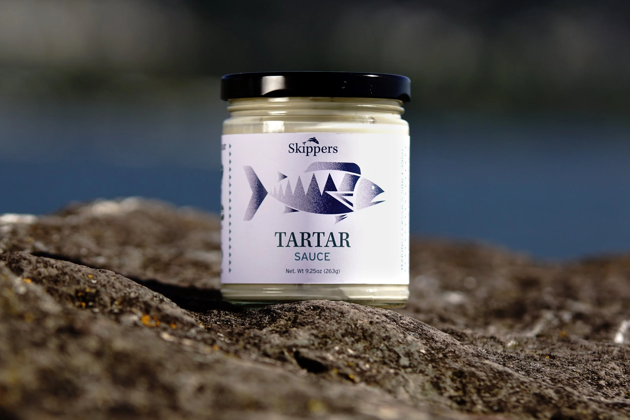
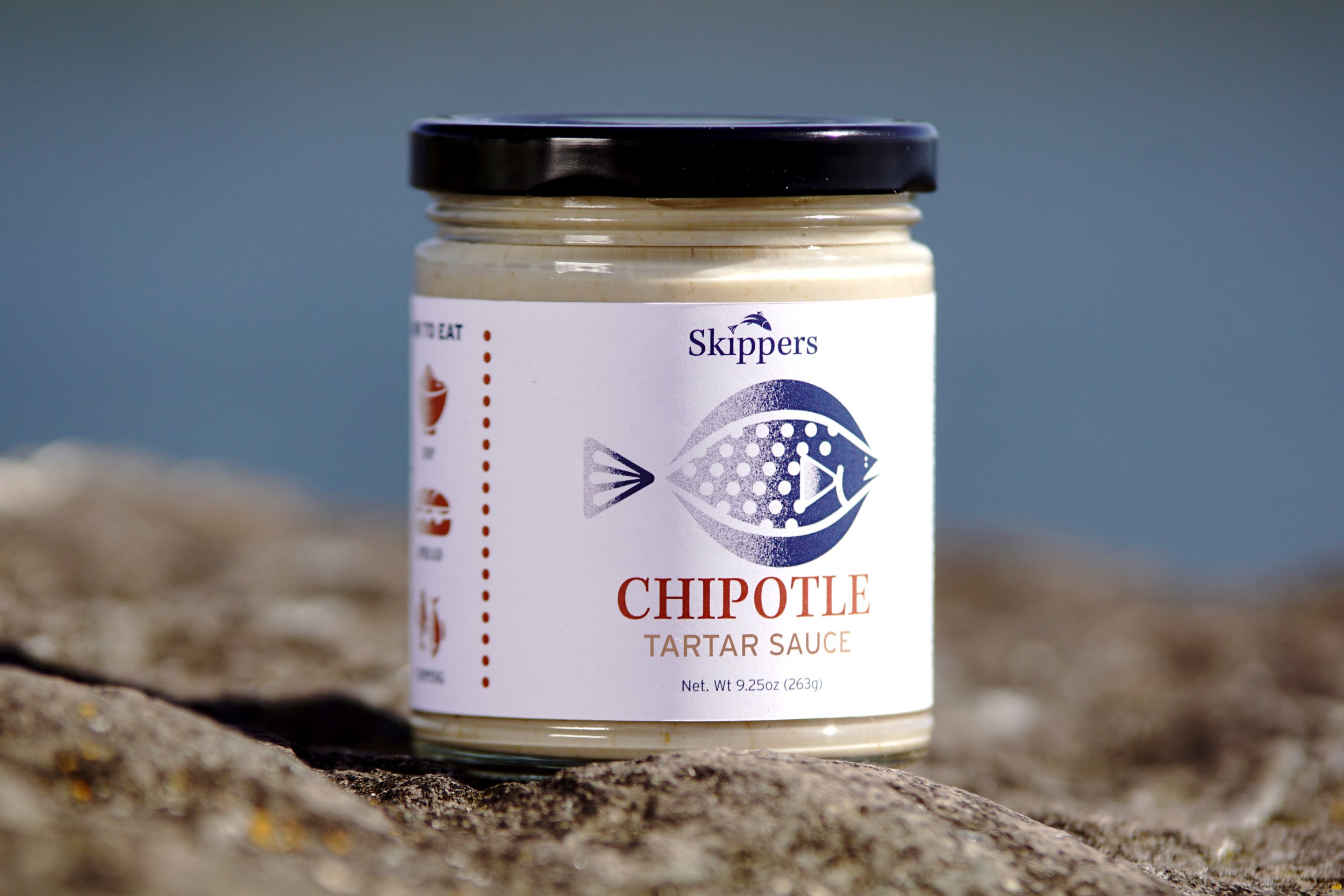
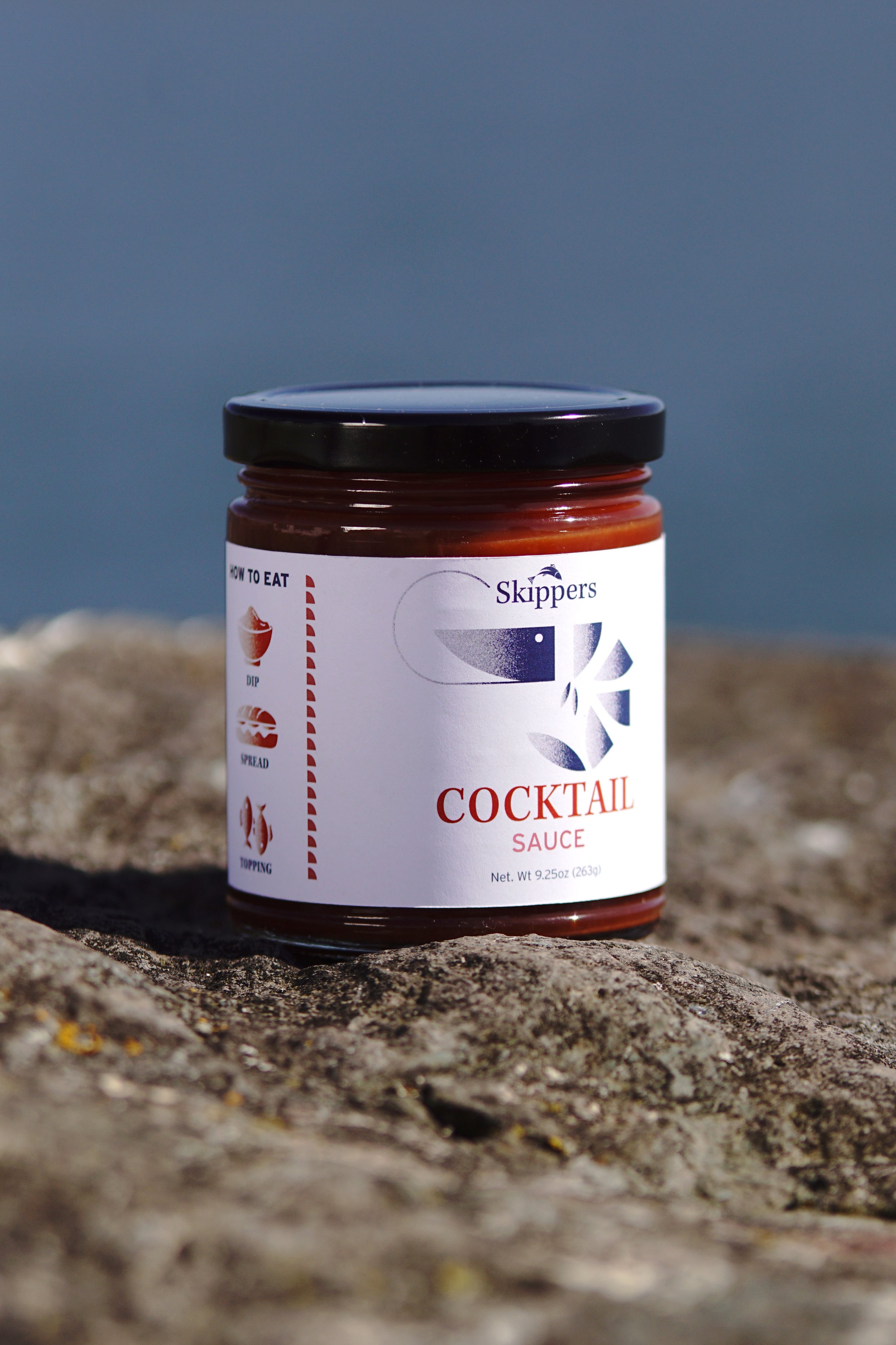
For this label packaging project, I aimed to create a cohesive design system that would seamlessly translate across three different flavors of tartar sauce. To avoid a look that was too modern or overly vectorized, I incorporated texture throughout the illustrations on the labels. Additionally, I had the opportunity to use my photography for the product shots, capturing images in Bellingham’s Bay to enhance the overall presentation.


Tartar Sauce
Main Illustration
#2D6670
#3C8A9E
Pattern
Label
Design Foundation
The design foundation aimed to create a cohesive system of illustrations for each flavor of tartar sauce. Every illustration features a unique geometric element that distinguishes each flavor while maintaining a unified look. The base color for all designs is navy blue, ensuring consistency across the range. However, each flavor introduces a distinct color scheme and pattern that complements its geometric shape. Additionally, the labels consistently include the words "DIP," "SPREAD," and "TOPPING," with the only variation being the color palette used.
Chipotle Tartar Sauce
Main Illustration
Label
#C1947D
#B25A40
Pattern
Cocktail Tartar Sauce
Main Illustration
Label
#CE716F
#D53E2C
Pattern
